
Chapter illustrations became a feature of my Princelings series, and in theory I like doing them. In practice, I get anxious about whether I can execute what I have in my head. I thought you might like to know what the process is, and why I like committing to #Inktober on years I have a book to illustrate.
Choosing an illustration
Obviously, chapter illustrations should be relevant to the contents of the chapter.
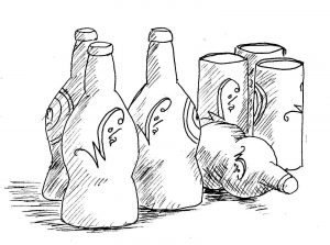
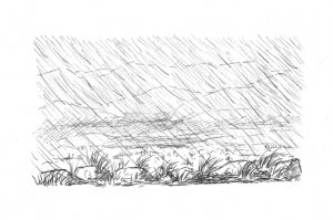
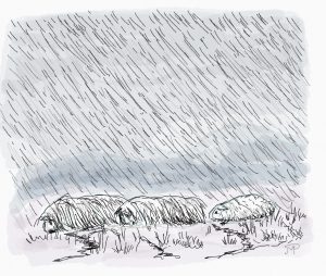
I usually copy the chapter headings, and sometimes make notes of scenes in the chapter, and then start getting ideas. I do simple line drawings, but I’ve extended these into landscapes on occasions. Sometimes I just pick up some articles that I can draw, like glasses, or cans of Wozna cola – which then involved designing their logo!
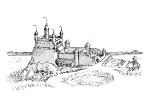
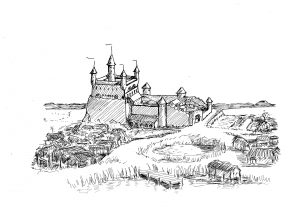
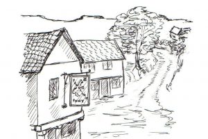
Doing the castle for the setting of the chapter is something I think helps readers, especially as I’m not the best at describing the detail of places that are clear in my head. Some of these are fun, as I’ve been making extensions to them over the years. I have versions of Castle Marsh from the 2008 version, through the changes as first the flying boats required boatsheds, and then the housing developed around the outside. I’m not sure how much more that needs to develop.
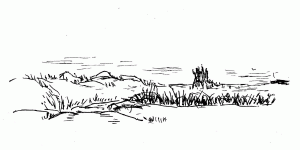
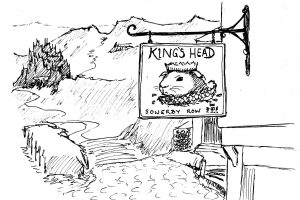
Some of them are easy, as the scene is clear in my head – some of my favourite ones turn up then, like the view from the road to Marsh from Castle Wash, which is on the edge of the dunes with the castle in the distance. In Hugo’s book (Traveler, #4) there were several scenes like the road past the Prancing Pony, where the stages have a terminus, like they do at the Inn of the Seventh Happiness. There was also a favourite in the view of Sowerby Castle in the distance, from the pub, the King’s Head, at Sowerby Row.

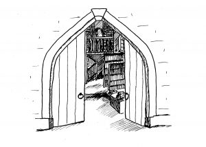
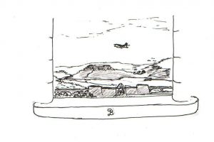
Some are really hard, with nothing seeming to really happen in the chapter. Then I need some sort of motif. Talent Seekers (#5) had a lot of those. A tray of swords. Doorways. Views from Windows are a good standby as well.
And yes, I do reuse illustrations across the books. It makes sense, really, for the main venues. Although I did do several new interior scenes for Buckmore in the last few books.
Paper or iPad?
All the books to date have started with paper and pencil drawings, inked over and the pencil rubbed out (sometimes you can see ones where I haven’t been very diligent on the erasing).
For Dylan’s adventure with the Lights of Ulva, I experimented with doing them on iPad. I’m not yet confident with my drawing skills on iPad, but I hope that practice will help. The iPen seems to behave differently than a real pen! But I also did colour versions of the Ulva ones. I found I could take an existing jpeg of a scene and colourise it in the iPad program. I’ve already tried this with Castle Marsh and Laurel-Eye (from book 6) for Chronicles.
So I’m hoping to do all the illustrations on iPad. If I get stuck, I’ll revert to pen and paper, then scan them in again.
Black & White or Colour illustrations?
Why choose colour? None of the earlier books have colour illustrations, and they’ll be black and white in the paperback version. There’s a good point. Maybe I need both. I tried this out with a view of Dylan, Dougall and Kevin on Rannoch Moor for Book 8.
The colour question was raised some time ago, when someone blogged about more books being read on hand-held devices rather than dedicated ereaders. I don’t know whether it’s true or not. If I’m reading an ibook, it’ll be on my iPad in colour. I should check whether the kindle app for iPad is in colour. My Kindle Paperwhite is quite old now; I wonder if colour illustrations would look okay on it? I’d better check. After all, I do have the Lights of Ulva to test this out on.
Cheating or not?
Is re-using old illustrations across books cheating? I’d like your thoughts on this. It is obviously better for me to re-use and illustration if I want to get all the details of a place right, and consistent across the books.
Some places could do with a revised drawing, though – like the Inn of the Seventh Happiness.
Technical stuff for ebook illustrations
If you’re thinking about illustrating your ebook, remember that you have to put them in your Word file as inline illustrations. The new kindle app may let you put them in another method, but I’m sticking to what I know at this stage. For epub files inline definitely works best.
I used to have huge problem with my kindle pics having extraneous lines surrounding one or more edges. It turned out that kdp converted colour jpeg files fine, but black and white ones needed to be inserted as GIFs. I think it’s to do with the way the computer system scans pixels. The solution was to do GIFs for my KDP files. Smashwords converted the original jpegs just fine in any ereader format.
 Inktober
Inktober is the illustrators’ A to Z Challenge. I love following it on Twitter, mainly. People post illustrations daily through October. There’s a prompt list on the inktober website, which you can use like A to Z gives you the daily focus. I think there’s a signup list, but just following it on social media is good enough for me.
I don’t do daily blog posts, but if you want to see them on Twitter, my handle is @jemima_pett. If I remember to post them.

I can answer a couple of questions. First, nothing wrong with re-using illustrations where appropriate. For one thing, I doubt most readers will remember, unless maybe if they are reading through the whole lot in a binge. Of course, I just used the same image for chapter headers on all three of the NL books, so what do I know? 😉
Second, yes, Kindle for iPad does color. As for whether a color image will work on the B&W readers, just try a quick conversion yourself in whatever photo editing software you have and see. Some color pictures might not be contrasty enough, but you should get a clear idea in a hurry. Then shrink to that 3X3” sort of thing you actually have on the Kindle or Nook and see if it’s still clear.
Have fun with the drawings!
Thanks for checking the iPad app for me. I totally forgot to look when I was reading on iPad last week. Given the time constraints, it may be easier for me to do good drawings on paper. That means I start with the B&W, and can colourise them later if I want to. Then I end up with both versions and can choose which to put in the files. The kindle-ready file has to be set up differently from the Smashwords one if I’m doing B&W, so that’ll get colour. Maybe colour on the ereader files, and B&W in the paperback. You can see what I mean by colourise in the D&D Rannoch Moor pics.
Your pics were fine – motifs rather than illustrations 🙂
I am so impressed!!! I cannot draw decent stick figures. 🙁