I hope most of you have admired my book covers. They are mostly down to my wonderful illustrator, Danielle English, with a varying degree of inspirational input from me. I think it was my second or third blog post where I realised I would have to have covers for my books, and they’d have to look good. I think I did look at what Createspace did for its cover creator (now part of the KDP set-up, too) and quickly realised I could recognise covers set up on that fairly easily. Nothing wrong with that. I wanted something that said more about the book (I was thinking of the first three at most, then) and could be replicated in some way to show the books were a series.
I can’t remember who mentioned Dani was finishing her Illustration and Design degree…..
 Anyway, I asked her, and told her to do it professionally and charge fees, and so she has, absolutely wonderfully, putting up with my desire for tweaks and changes and sometimes a very firm idea of what I wanted that I was totally inadequate in putting into a design brief. But now Dani has an engrossing job doing what she’s been trying to get into ever since leaving college, which is games design, and she seems to be doing well with it. You can follow her work on Twitter @Dannie_62 where she’s been posting wonderful pen & ink sketches during #inktober and also on her website kanizo.co.uk
But I am left without an illustrator.
I’ve been keeping an eye on who does what in what style for my fellow BookElves, and given the established style of the Princelings covers, I think one or two might be able to do something with their flair in my constraints! But for the Viridian series, and also for some of the editing type things needed for the BookElves Anthology 2 cover, I set about teaching myself what to do. My old computer held a program very like Photoshop, which I used to do the cover of White Water Landings, which was a collage of photos. It’s a steep learning curve, working with layers, and different types of layers, but I struggled through and I was pleased with the result. I had an idea of what I wanted to do, and did it.
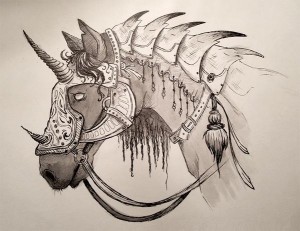
I also have an idea of what I want to do for the Viridian series. The problem comes when I want something unique, something which requires proper drawing skills. The other problem was using an old program on an old computer, which just wasn’t up to it.
The solution seems to be Gimp, which was recommended by one of the publishing systems I use, possibly Blurb. It’s a free package, which seems to do far more than I would ever get round to doing, although it still isn’t a full drawing package.
As with learning anything, you have to be ready to throw it away and start again. I started with the simple task of putting titles on my Viridian System Sampler. Then The Perihelix could get some titling on a picture using the Cover Creator system, but not how I wanted it, and I also wanted to have a ‘device’ on the front. I had a vision for The Perihelix, just as I had for Princelings of the East, but the execution was more difficult.
 But if you do have some pictures you want to put in place and/or merge, and some titles and text to put over them, you can use Gimp (and probably most photoshop-like packages) to build these things up in layers. Gimp is free, big, and well-respected.
- start with a background layer the right size and quality (in dpi) – Kindle and Smashwords both give guidance in their help areas, and Createspace has too, but basically its a size 0.5 inch all the way round larger than your book size, and 300 dpi minimum printing quality.
- add your background layer. If it doesn’t fit you may need to work out what colour or pattern background to set it on (too small) or how to resize it to make it smaller if it’s too big.
- I learned to make sure I was dealing with something I wanted to resize as a layer, not pasting it into an existing layer. So open a new photo as a layer, don’t paste it.
- You can rub out bits of layers to reveal what’s underneath. This is the best trick I learned for White Water Landings. It enables you to superimpose a person in a picture onto a different background.
- You can add text. With Gimp I find this tricky to change once I’ve started, and have most success if I’m working with the editing panel, a little pop-up box that takes the text. Watch out for unintended edits, like I found a ‘jump’ in my text which was because it had included an unintended change in the kerning (spacing and placing of letters)
- Do different fonts in different text boxes. At present, I am frustrated by the zillions of fonts in Gimp that are nothing like those I want. To use a serif font like that Dani used for the BookElves original cover, my best match is Baskerville, and they don’t do Garamond, which I use for the Princelings internal font. But they have lots of sans serif (serif is the one with twiddles on the ends of the letters, sans doesn’t have that – sans = without), and I found Charter works well instead of Garamond.
- Look at other covers and see what you want to do. I discovered how to put a background in the text box that I could then partially rub out, to give the text a nice shaded appearance which made it stand out.
- I haven’t been very successful with drawing and colouring yet, although I have done some smudging of one colour across another, and I’ve worked out how to fill a square or circle with a colour that fades out. Lots of practice needed.
- Save your files whenever you’re satisfied with them – as new files. Then you can ‘undo’ the next phases until you’re satisfied with the next bit, or go back to a step earlier if you realise you’ve done something wrong.
- Export to the format you need for your cover(s) when you’re done. Kindle and Createspace want jpeg or tiff, some of the other publishing software (e.g. Blurb) will take png. But Blurb only needs the pictures, you can add you titles and text using their own fonts and layouts.
 So that’s what I’m doing at present, and I’m most pleased with the back of the BookElves Anthology 2 paperback. Apart from Dani’s wood-grain which was slightly too small for the paperback version, and her original logo, which sometimes goes in with a transparent border, and sometimes doesn’t, it’s all my own work. (The space bottom right is for the barcode)
But that still leaves me with a problem about things that need drawing. Fortunately my wonderful editor, Dawn, is an ace with Photoshop, and has done the ‘device’ for the Perihelix. I’ll do a final cover reveal in December – although I revealed one version last month, and Viridian series website readers will be asked to make a choice tomorrow!

Oh, dear! I don’t like to hear that Dani is too busy to do covers, as of course she has done all of mine, and done an amazing job of it. And, as with many of your books, I need original art. I dread the search for another illustrator; I was in despair when I found Dani (well, stole her from you 🙂 ).
I can do some of the basic stuff in photoshop okay, and can learn more, so assembly isn’t beyond me. But I certainly can’t draw the pictures 🙁
It’s worth checking with Dani, I think, especially as she’s said nothing to you. Preferred client status, maybe! As always, it depends on her main workload. She may feel she can still tackle yours, it’s just me that niggles on changes 🙂
I’ve remained amazed at the process, since it’s all done remotely, and I don’t have a very visual imagination. That’s not quite right, but I can’t picture what I want very well, so have to start with something very vague! It’s funny–I work on covers at my end with a co-worker at the library. She has excellent visual sense, sees all sorts of stuff I can’t, but like me can’t draw. Still, I couldn’t do the covers without her, either.
She’s doing the current cover, anyway–nearly done, just making some of those changes…. 😀
And yes, Steve has shown he has talent!
I can picture what I would like, but am very bad at describing it or putting it into a brief. I often end up doing sketches, but those can be misleading as I don’t do the effects very well. Either that or they think my ideas are rubbish and don’t want to say so (I had a similar issue with my ‘device’ for the Perihelix cover).
Great job, Jemima.
I suspect you could be our number one first choice, Steve!
I have Gimp and use it a little, but I don’t know too much to do a lot of designing. Good luck.
Thanks, Patricia. I’ve just managed to do something new today – small steps!